Temperature Quilts in Python
Posted on Tue 31 January 2023 in data science, art
What is a temperature quilt?
A temperature quilt displays the daily temperature data from a specific date range in a specific location. Colors are assigned to specific temperature ranges so that the quilt (or image) is a visual record of the climate. This app is a demonstration project for data storytelling that I constructed in the PyBites Professional Developer Mindset Program.
This project uses pandas, Pillow, matplotlib along with Streamlit.io to construct a data story and a work of art! This project has some unique constraints and requirements (including a pdf quilt pattern) so users can construct an actual quilt using a commercially available fabric.
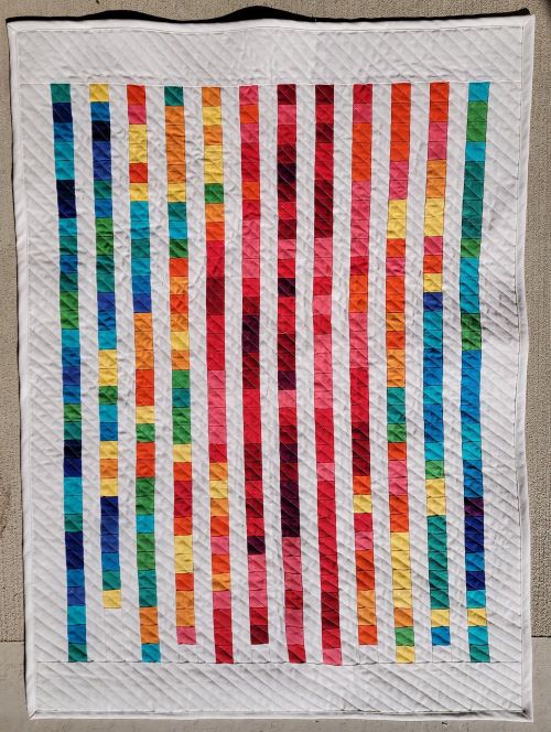
A photo of my constructed data quilt
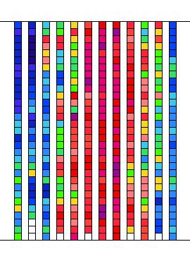
Digital Quilt Mockup and Streamlit
The streamlit app is located at DataQuilt. Once you've opened the app, simply put in your US zip code and year. Then, the app will automatically search for the closest weather station that contains a maximum amount of data for your specified year. The information comes from the National Oceanic and Atmospheric Administration's (NOAA) Global Historical Climatology Network daily (GHCNd) of weather stations. Once the closest weather station with the most data is located (not all weather stations have a complete data set), the daily maximum temperature data is binned and each bin is associated with a particular color. From this, a digital mock-up of a temperature quilt and a corresponding pattern for the physical construction of the quilt is created automatically.
The code is located in the github repository: H-A-DYE/DataQuilt.
If you're interested in the art post about this project, it is located at Heather Ann Dye Art.
Where to get the data
In the dataquilt package, the weather_station_inv module sorts through NOAA's inventory of weather stations. NOAA provides an inventory of weather stations at https://www1.ncdc.noaa.gov/pub/data/ghcn/daily/ghcnd-inventory.txt. Each line in this text file lists a weather station, along with its lattitude and longitude and years of activity. This module strips the information out of the text file using string methods and creates a pandas dataframe. Next, weather stations are eliminated from the dataframe based on years of availability. Then, the provided zip code is converted into latitude and longitude (using geopy) and the distance between each weather station and the zip code is in nautical miles. The app uses the 10 closest weather stations in the next step.
Request data from NOAA for a specific weather station
In data_from_api, data for a selected year and weather station is requested from NOAA. However, not all weather stations have a complete set of records. The app examines the 10 closest weather stations and selects the weather station that has the most complete set of data. I used the requests package to request the data from NOAA and extract a json data which is transformed into a pandas data frame. The data frame is examined for missing values and out of the 10 nearest weather stations, the closest station with the least missing data is selected. In the next step, the app creates a digital mockup of the quilt.
def identify_missing_data(
    data_series: pd.Series,
) -> list:
    """Returns the indices of nan values in a pandas Data Series.
    Args:
        data_series (pd.Series): pd.Series
    Returns:
        list: List of indices with nan values.
    """
    local_array = np.where(data_series.isnull())
    local_list = local_array[0].tolist()
    return local_list
Descriptive Statistics with pandas
In image_generator, pandas is used to organize the data into a suitable format. Using pandas' descriptive statistics methods, I constructed a custom binning function based on the maximum and minimum maximum daily temperatures from the dataset. This custom binning function sorts the data into bins ennumerated from 0 to 14. Lambda functions are used to reformat the date and the binned maximum daily temperatures. Next, the dataframe is reshaped and missing data values are filled with a null value of 15. Each numerical value from 0 to 15 corresponds to a specific color in the digital mockup. This binned dataframe is use to create the digital mockup.
 my_dates = noaa_data.DATE
    datetimes = my_dates.apply(
        lambda x: datetime.datetime.strptime(
            x,
            "%Y-%m-%d",
        )
    )
    months = datetimes.apply(lambda x: x.month)
    days = datetimes.apply(lambda x: x.day)
    noaa_data = noaa_data.assign(days=days)
    noaa_data = noaa_data.assign(months=months)
    my_levels = noaa_data.TMAX.apply(
        lambda x: grade_temp(
            noaa_data,
            int(x),
        )
    )
    noaa_data = noaa_data.assign(levels=my_levels)
    my_small = noaa_data[["months", "days", "levels"]]
    my_reshape = my_small.pivot(
        index="days",
        columns="months",
        values="levels",
    )
    my_reshape = my_reshape.fillna(15.0)
    return my_reshape
The next step is to tabulate the number of days in each bin and record the temperature ranges and insert these values into a data frame. This data frame is essentially a frequency distribution table and is formated with the end user in mind. Streamlit.io displays both the binned dataframe and the tabulated dataframe, which are also available in the pdf pattern file. The binned dataframe and the Pillow package are used to create the digital mockup of the quilt.
Real fabric!
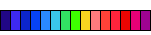
In the colors_kona module, we construct rgb codes for real, commercially available fabric colors in the Kona cotton fabric line, a commercially available fabric line. This brings my pdf pattern into line with industry standards for quilt patterns. Quilters can purchase the listed fabrics and create a quilt identical to the digital mockup.
Here is the color range for your reference.
The cmyk color codes to rgb codes and created a dictionary to contain the color information.
def make_kona_dictionary(colorlist: dict = COLORENNUMERATE) -> dict:
    """Takes a dictionary of Kona color names and number keys and returns a
    dictionary with number key and Color_Information for Pillow.
    Args:
        colorlist (dict, optional): Kona color list and keys.
        Defaults to COLORENNUMERATE.
    """
    color_dict = {}
    for i in list(colorlist.keys()):
        color_name = colorlist.get(i)
        local_row = DF_KONA[DF_KONA.name.str.contains(color_name)]
        cmyk = local_row.iloc[0][3]
        rgb = color_conversion_rgb(cmyk)
        kona_info = ColorInformation(color_name, rgb, i)
        color_dict.update({i: kona_info})
    return color_dict
Streamlit Dashboard
The frontend/dashboard is constructed using Streamlit.io. Streamlit displays each step of the process outlined above. The data can be inspected in the dashboard and the download button allows users to download a pdf with all the necessary information to create a physical version of the digital mockup. The app can be used to create multiple mockups based on year and zip code.
Conclusion
This fun demonstration project has led to several other on-going projects that I hope to blog about soon. So if you're interested in data storytelling in a community friendly way, keep following along!